Your spa booking calendar might be the reason clients are not completing their reservations. The way you display available times shapes how easy or frustrating the booking experience feels. And in a world where clients expect the same frictionless experience they get from restaurant and airline apps, your spa booking page needs to keep up.
This post breaks down the two most common booking calendar layouts, how clients experience each, and how to choose the right one for your esthetics practice.
Why Booking UX Matters for Solo Estheticians
You are not competing only with other estheticians. You are competing with every seamless digital experience your client had today, from ordering coffee on an app to booking a flight in thirty seconds. If your spa booking calendar feels clunky, outdated, or confusing, that client is one tap away from closing the browser.
A booking page that is easy to use turns more visitors into appointments. Run the math on your own numbers: if a better layout adds even 1.5 bookings a week at $145 each, that is about $11,300 per year.
That is not a redesign for vanity. That is a redesign for revenue.
The booking calendar is where intent becomes action. A confusing layout costs you clients who were ready to pay.
Before the Layout, Decide Which Slots She Sees
Full calendar or day-by-day is a question about arrangement. There is a question underneath it that matters more: which times appear at all, and in what order.
A standard booking page answers it the simple way. Clock order, every open slot, earliest first. That is a filing system. It is not a strategy, and it is why so many estheticians end up with a Tuesday holding a 9am and a 3pm and nothing that can fit between them.
Smart Availability is a business-wide setting with three modes.
Clock order. The default. Times run earliest to latest, which is what you already have.
Keep my day together. Every open slot gets scored by how much of the day it would waste and how much usable space it would leave behind, and the best fits are the ones next to an appointment you already have. A 10:30 that runs flush against something already on your books fits better than a 2pm that strands two dead hours on either side. There is a sub-setting for how far to take it: offer every time, or narrow the list to a window before and after an appointment you already have. Either way, the times she sees are listed in clock order.
Hide a percentage of open times. A page that is nothing but white space reads as a slow week to the person looking at it. This mode shows fewer of the empty slots.
Two details keep "keep my day together" honest. Every legitimate time stays reachable through "See all available times", so the client who specifically wants your 4:15 is never blocked from it. And on a day with nothing booked yet, full availability shows, because there is no day to keep together. Hiding is different: the times it hides cannot be booked or requested online.
Pick the mode first. Then pick the layout, because the layout is how a good list gets presented, not what makes it good.
The Two Main Calendar Layouts
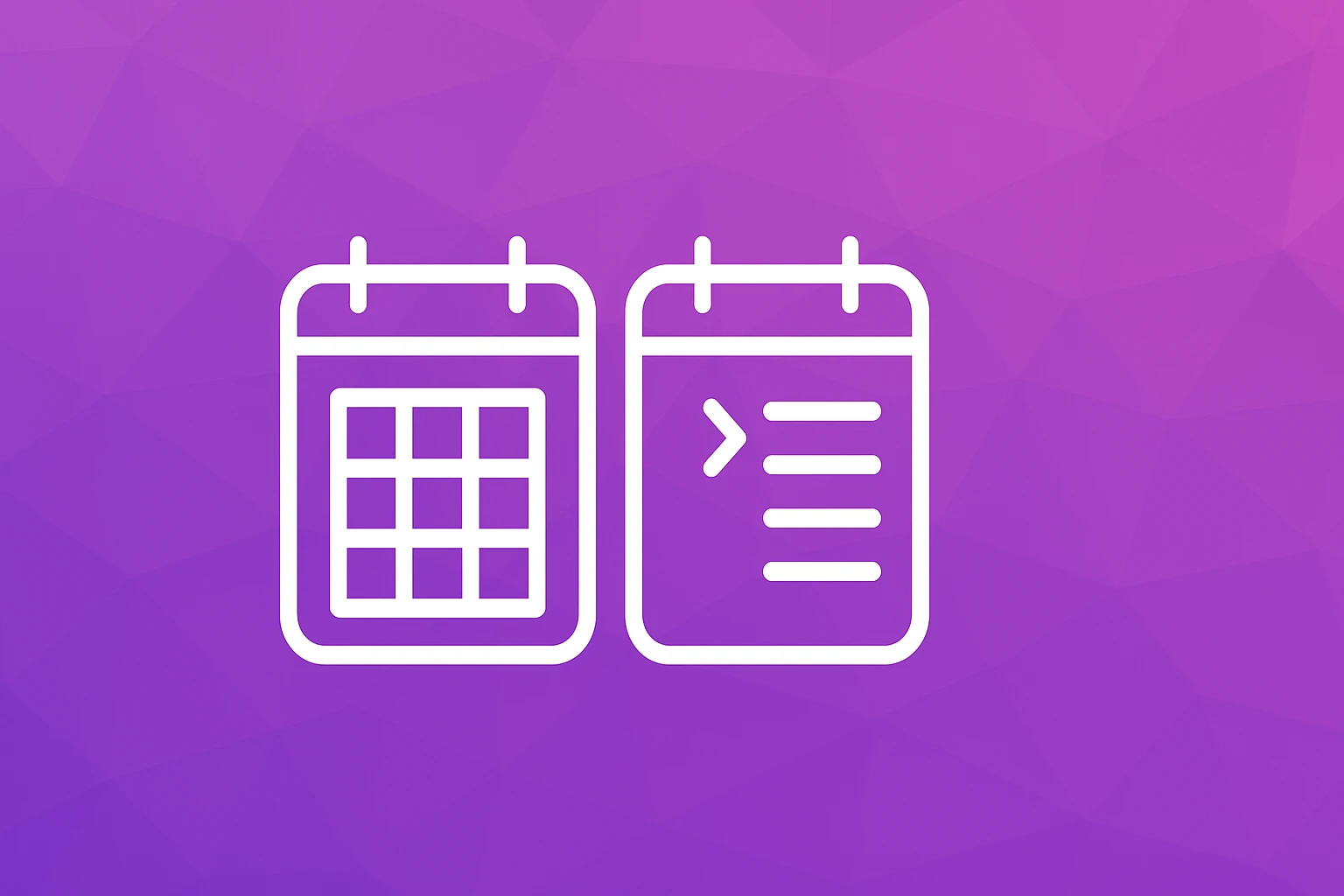
Full-Calendar View
A full-calendar view shows the entire month at a glance. Clients see a grid of days, usually with color-coded indicators showing which days have availability. They click a day to reveal open time slots.
What a client might say:
- "I can see the whole month and plan around my schedule."
- "It is easy to spot which days have openings."
- "I prefer choosing the day first, then the time."
Where it falls short:
- On mobile screens, a full month grid becomes tiny and hard to tap.
- Clients may feel overwhelmed when many days are available.
- It adds an extra step: pick a day, then pick a time.
Day-by-Day Slot View
A day-by-day view shows a short list of the next available dates with specific time slots already visible. Clients scroll through a curated set of options and tap one to confirm.
What a client might say:
- "I can book in seconds. I just pick the first time that works."
- "It feels simple and focused. No hunting for the right day."
- "Works perfectly on my phone."
Where it falls short:
- Clients who want to book two or three weeks out may need to scroll more.
- It can feel limiting if only a few slots are visible at a time.
What the Research Says
Choice research has long suggested that fewer options make decisions easier. When clients see a handful of available slots front and center, booking tends to feel quicker.
A full-calendar view works well on desktop, where screen space is generous. But many clients book from their phone, and on a small screen a day-by-day slot view is usually easier to use.
The takeaway is not that one layout is universally better. It is that the best layout depends on your client base and the device they use most.
Check your booking analytics. If more than half your traffic comes from mobile, a day-by-day slot view will likely convert better. If your clients tend to book from desktops at work, a full-calendar view can work well.
How Each Layout Affects Your Schedule Strategy
Your choice of booking calendar also influences how you manage your own time. A full-calendar view gives clients complete visibility into your month, which means they might book during slots you intended to keep as buffer time. A day-by-day view gives you more control over which slots clients see first.
But neither layout decides the shape of your day. Slot ordering does. Two bookings can produce the same revenue and a completely different afternoon depending on where they land, and "keep my day together" mode is the setting that cares about which one you get. Turn it on and the calendar stops treating 11am and 3pm as interchangeable just because both are open.
If you use calendar sync to block personal time and manage your calendar effectively, both layouts can work. The key is making sure your booking tool respects your boundaries regardless of what the client sees. For a deeper look at protecting your schedule while staying fully booked, read our spa schedule strategy guide.
Example: Testing a Layout Change
Say you use a full-calendar booking page and notice that clients on phones start booking but do not finish.
Run a simple test. Write down your current mobile and desktop conversion rates -- completed bookings divided by visitors to your booking page. Then change one thing: the calendar layout, for example by moving to an online booking page with a day-by-day slot view. Keep the same services, the same pricing, and the same availability.
After four weeks, compare the same two numbers. Because nothing else changed, the difference tells you how much the layout itself matters to your clients.
Common Mistakes With Booking Calendar Design
Mistake 1: Showing too much availability. When every slot for the next 90 days is visible, it creates decision fatigue. Too many options can make clients put off booking. Show two to three weeks of availability at a time, and if your platform can hide a percentage of open slots or narrow the list to the ones that fit your day best, use it rather than publishing a wall of white space.
Mistake 2: Not testing on mobile. If you designed your booking flow on a laptop, you have no idea what it looks like on a phone. Book yourself from your own phone at least once a month.
Mistake 3: Ignoring load time. A calendar that takes four seconds to render loses clients before they even see your availability. Choose a booking platform that prioritizes speed. If clients are abandoning your booking flow entirely, slow load times may be contributing.
Mistake 4: Using a generic scheduling tool. Tools built for meetings and consultations do not understand spa workflows. They lack service descriptions, buffer times between appointments, and intake form integration.
Mistake 5: Forgetting about returning clients. Your calendar should recognize returning clients and pre-fill their information. Every extra field they have to complete again is friction.
Step-by-Step: Choose and Optimize Your Booking Calendar
Step 1: Check your traffic split. Look at your booking page analytics. What percentage of visitors are on mobile versus desktop? This single data point should guide your layout choice.
Step 2: Choose your primary layout. If mobile traffic exceeds 50%, lead with a day-by-day slot view. If desktop dominates, a full-calendar view can work. Whichever you choose, make sure your booking page works as well on a phone as on a desktop.
Step 3: Limit visible availability. Show 14-21 days of availability at a time. This balances flexibility with focus. Clients can always scroll or tap "more dates" if they need to look further ahead.
Step 3b: Set your availability mode, not just your hours. Clock order if you want nothing clever happening. "Keep my day together" if your afternoons keep getting cut in half by a single mid-day booking. Hide a percentage of open times if a nearly empty week is making you look slower than you are.
Step 4: Add context to time slots. Instead of bare time stamps like "10:00 AM," show "10:00 AM - Glow Facial (60 min)." Context reduces confusion and speeds up decision-making.
Step 5: Test your flow monthly. Book a test appointment from your phone every month. Note anything that feels slow, confusing, or requires too many taps.
Step 6: Gather client feedback. After a new client's first visit, ask one simple question: "How was the booking experience?" Their answers will reveal problems you cannot see from the back end. For trust signals that matter before clients even reach the calendar, read about what your booking site needs.
FAQ
Q: Can I offer both calendar layouts and let clients choose? A: In theory, yes, but in practice it adds complexity. Most clients prefer one clear path. A responsive platform that adapts to the device is a better approach than asking clients to pick a layout.
Q: How many time slots should I show per day? A: Show all genuinely available slots, but limit the visible date range and think about the order. If a client sees 12 open slots on Tuesday, that is fine. If they see 12 open slots on every day for the next three months, that is overwhelming. Smart Availability handles both ends of this: it can narrow the list to the slots that keep your day intact, with every real time still reachable under "See all available times", or hide a percentage of the empty ones.
Q: Does calendar layout affect no-shows? A: Indirectly, yes. When clients book quickly and confidently, they tend to feel more committed to the appointment. A confusing booking flow can lead to half-hearted bookings that are more likely to become no-shows.
Q: Should I show real-time availability or batched time slots? A: Real-time availability is more accurate and prevents double-bookings. SpaSphere syncs your calendar in real time so clients always see what is genuinely open. If you are managing availability across multiple tools, calendar sync keeps everything aligned.
Q: What about clients who like to book the same recurring time each week? A: For repeat clients, the calendar layout matters less because they already know what they want. The key for returning clients is speed: pre-fill their info, remember their preferred service, and let them confirm in one or two taps.
Your Calendar Is Your Storefront
Think of your booking calendar as the front door of your spa. If the door is heavy, stiff, or hard to find, some people will turn around. If it swings open effortlessly, they walk right in.
The layout you choose should match how your clients actually behave, not how you think they should behave. Test, measure, adjust. Small changes to your spa booking calendar can lead to meaningful revenue gains without spending more on marketing.
SpaSphere's booking page works on phones and desktops, and Smart Availability scores each open slot so the times she sees are the ones that keep your day together.